Making work work, together.
CAREER COACH & CONSULTANT
Ways to work with me
CAREER COACHING
For mid-career professionals who are done guessing and ready to move with intention. Whether you're chasing a promotion, building your reputation, navigating a big change, or delivering something high-stakes — we get clear on what's really going on and build the strategy that gets you there.
WORKSHOPS
Interactive workshops that blend mentoring and coaching — so attendees leave with practical tools, a renewed sense of agency, and a genuine reminder that they're not 'too much.' Choose from four signature topics or something custom.
PROJECT DELIVERY
For leaders who need transformation delivered expertly whilst they focus on their day job — available in Done-With-You and Done-For-You formats. Whether you want a collaborative partner to shape and build the solution alongside you, or someone to take the wheel completely, I design and deliver initiatives across retention, onboarding, community and engagement.
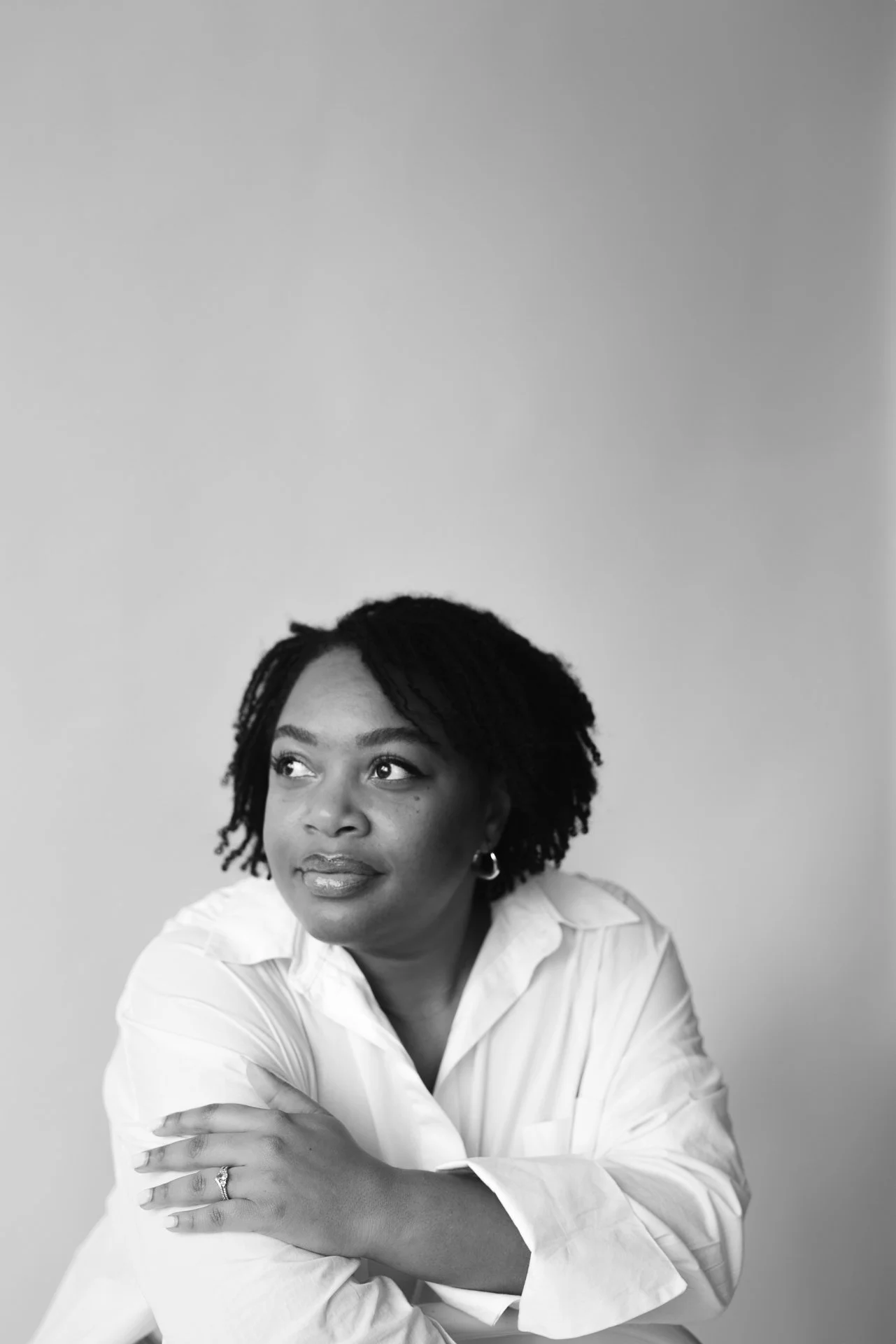
Hi, I’m
Through private coaching, workshops and project delivery, I’ve built a practice around a simple idea: your career growth is a collective and life-changing endeavor and you deserve a strategy that treats it like one.
As the daughter of two multi-hyphenate parents, I knew my career would be anything but traditional. When you send your first invoice at 14, you develop a relationship with creativity and innovation that doesn’t sit well in traditional boxes.
I work with mid-career professionals who are done coasting and ready to make intentional moves. My straight-talking, no-fluff approach means every session leaves you both clear and equipped — not just inspired.
The goal isn’t to become someone else. It’s to step fully into who you already are.
Making work work, together podcast
After the Hustle is where unofficial leaders come to ditch the grind and discover sustainable paths to career success. This isn't just another career podcast - it's a community of like-minded professionals who understand that learning and development become 10x more powerful when we do it together.


